Pixel Art Illustration
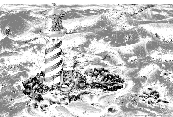
The pixel art illustration presented on this page was meant to be used as a splash page for the website of a group of Dutch people, called Internet Creatieven.
The size of the original illustration is 1.600 x 1.040 pixels; 1.664.000 pixels. The illustration is drawn in MS Paint with just three 'colors': light gray, dark gray and black. It took me around 560 hours to create, over a period of approximately one and a half years.
Around 170 steps are saved during the creation process, in order to generate an interactive flash animation. Once the Adobe Flash animation is loaded, click and drag inside the illustration to see all the steps involved.
Arrows
In the 'must-see'/'know your classics' documentary, style wars, a graffiti Artist, named Case/Kase 2, 'king of style', proclaims that "every one has his own perfect arrow". A nice thought.
I have my own perfect arrow as well, so I've added two of them. Both
pointing to my nameless puppet.
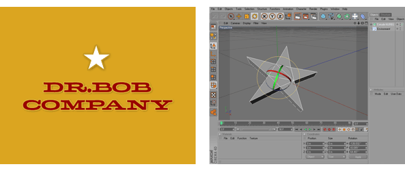
Notice that the logo of the Dr. Bob Company - a pentagram - also
points towards my nameless puppet.
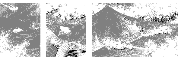
Rescue Chopper
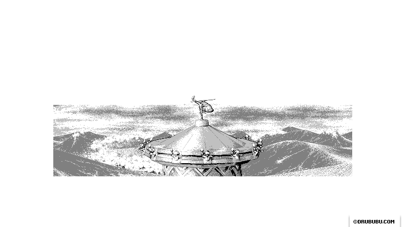
A miniature rescue chopper is placed on top of the lighthouse as a wind
vane.
I stumbled upon several types of choppers while searching for reference
images. Every type had its own characteristic outline.
The first one was a Bell UH-1 (used during the Vietnam war), the
second one a Sikorsky S-76 or Super Puma, the third one an R22,
and the last one a Chinook.
The exact name was not important; the overall shape was.
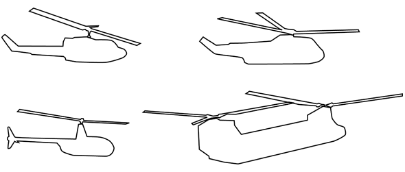
I chose the first one. The shape was perfect, and this kind of chopper
was used for rescue operations as well.
The second one was too big and the third chopper too small/fragile. The
last one was also too big - the roof would collapse underneath its
weight and/or be blown away as a consequence of its big surface - and it
was too army-related.
Bottlenose Dolphin
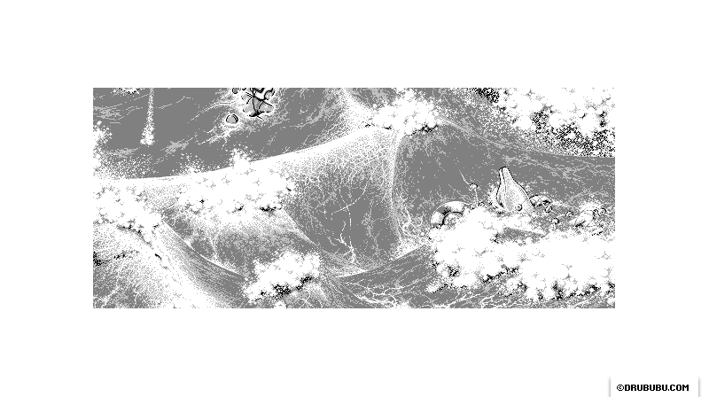
The bottlenose dolphin is added at the moment of finishing the pixel art
illustration.
The dolphin is struggling to set itself free from a fishnet.
Logo dr. Bob Company
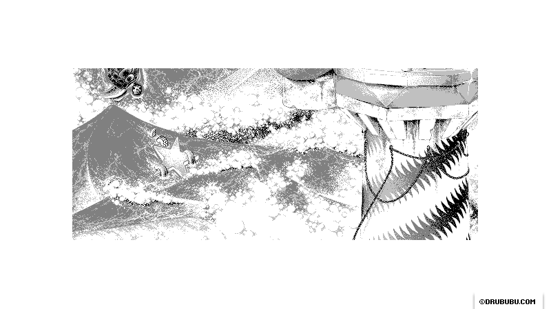
The Dr. Bob Company is a company owned by Stevijn.
Stevijn is the new supervisor of the Internet Creatieven.
When I was thinking of details that could be included, I wondered
whether there was something that could refer to Stevijn.
I decided
to use the pentagram of his company logo.
I used the 3D program Cinema 4D to create the star, after drawing some
pentagrams by hand. I found it difficult to draw the star in a
mathematically correct way.
I drew a lot of details that could be added, one of them being an
octopus. I thought it would be a nice idea to combine the pentagram with
the octopus arms.
The suction cups of the octopus arms are essential to make it
recognizable as an octopus.
Puppet
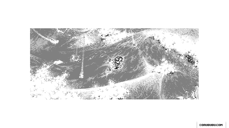
My nameless puppet in the sea, with its face in the water. Nearby - not visible in the animation - a life preserver...
Lighthouse
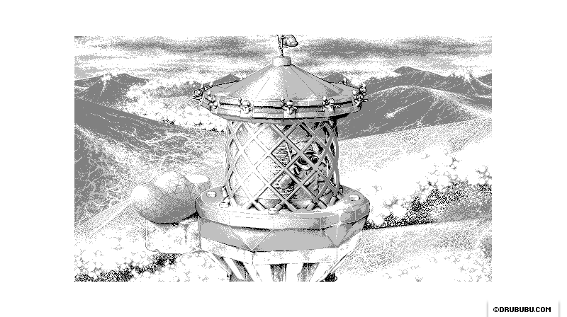
I could have used the common striping of a real-life lighthouse, but I
chose not to.
In other projects, I tried to analyze so-called 'Bézier curves'. The
knowledge I gained I used to generate the more decorative pattern in the
illustration.
See the 'Adobe Illustrator'
chapter for more (technical) details on the pattern of the lighthouse.
On the roof of the lighthouse, you see twelve nameless puppets.
I thought it would be a nice element referring to sculptures of the
twelve apostles on churches in the Middle Ages.
I had to take care of which arm was extended, in order to prevent people
from getting the idea that the puppets represent Nazis.
An extended arm, together with a fire torch, can be a very dangerous
combination, so instead of the right arm I used the left arm, which is
not extended but just reaching into the relative darkness.
Radar Installation
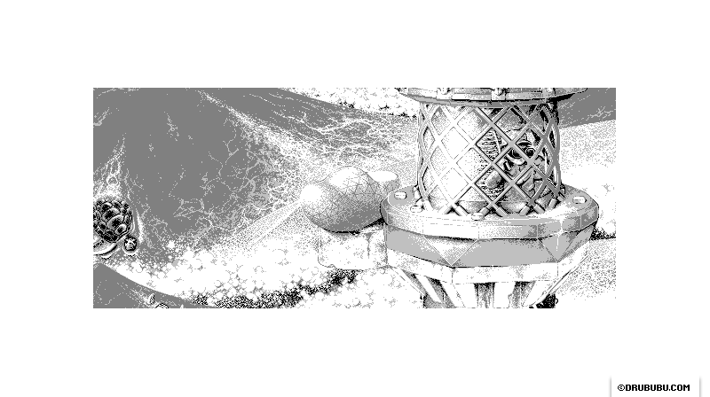
On top of the lighthouse, I placed a faceted-shaped radar installation.
In real life, this is most likely a faceted sphere like the kind you
find at airports and military bases, but in this case I used the wooden
shoe shape again.
It took some effort to get the right look.
Initially I drew, besides the outline, some extra lines that followed
the shape.
The facets didn't give me enough information about the shape, so I set
the facets aside and first shaded the object, which gave me a much
better spatial reference to the overall shape.
The previously removed facets were placed over the shaded object; then
carefully removed in some places to preserve the spatial look of the
wooden shoe shape.
The wave in the background is slightly changed: the difference between
the front side of the wave and the top of the wave is reduced.
Rocks
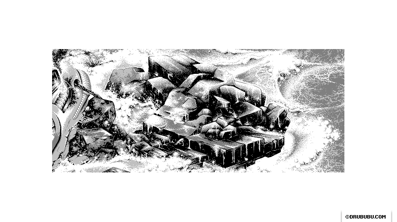
The outline of the rocks is derived from the sketch. In some cases, I
didn't follow the sketch.
I needed the outline in order to see how the rocks are shaped; in my
mind I tried to fly around the rocks to 'see' how the shape looks like
in three dimensions.
The shading of the rocks I did on the fly. Depending on the shape and
the shading of neighboring rocks, each individual rock is shaded.
I started the pixel art illustration with the rocks. It was a very
exciting moment, not knowing exactly what to expect, and not knowing
whether or not I would succeed in finishing the pixel illustration to my
own satisfaction.
Seaotter
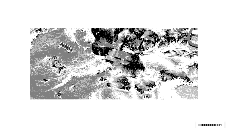
Just like the bottlenose dolphin, the sea otter is added upon finishing
the illustration.
I took some time to think of objects/animals that would be found in the
sea, as extra details, and one of them was the sea otter.
The sea otter offered the possibility of adding some extra details. A
sea otter puts its food on its belly, usually shells.
Instead of shells, I used the letters 'A' and 'H', the initials of
Annedien Hoen, the founder of Internet Creatieven.
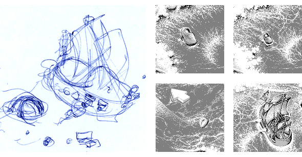
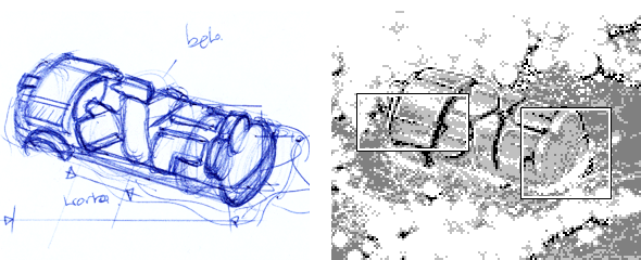
Wooden Shoe Ship
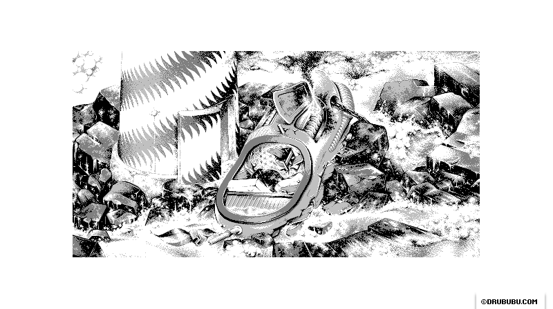
Some details of the wooden shoe ship took me some time to make.
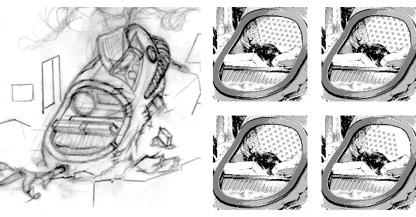
For example, the interior. I found it very difficult to get the right alignment of the knots, which
can be seen by the amount of variations.
The interior of the wooden shoe ship differs from the sketch I made. The
interior of the sketch is visually quite static. To make it more
dynamic/dramatic, the interior is meshed up, due the collision with the
rocks.
If you look closely to the left side of the ship, you may discover the
reflection of the lighthouse.
Notice how the door of the lighthouse changes a few times during the
process.
Sea Tornado
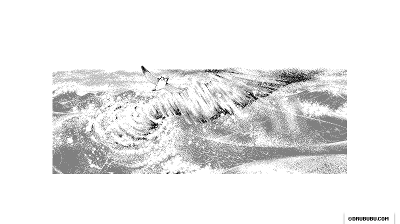
I added this part of the illustration towards the end, and it wasn't
planned at the start.
When I reviewed this part of the illustration, I thought the upper right
part could use some extra detail, which resulted in the tornado.
Once the tornado was drawn, I realized that it was not fully integrated
into its surroundings. After some analyzing, I realized I had forgotten
to drawn the debris near the tornado, so I added falling water with
splashes to the surroundings around the tornado.
I added a rainbow and a bird as well.
Totem
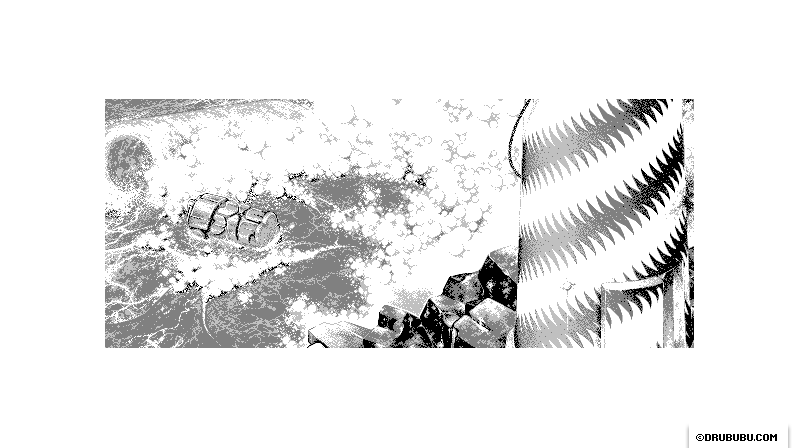
A totem, which can be found on the coast of Canada.
I noticed a lot of the depicted creatures have their arms crossed, so I
made a native version of my nameless puppet with his arms crossed as
well.
Notice the tree-rings at the end of the totem, and some cracks parallel
to the length of the tree.
The initial sketch is reduced in size to fit into the surroundings
without drawing too much visual attention to itself.
Green Turtle
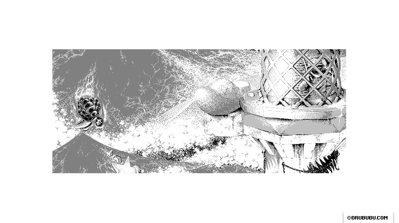
Initially I drew two green turtles. I decided to remove the smaller
one.
The contrast of the green turtle with its surrounding is quite high. By
using two green turtles, this part of the illustration would get too
much attention from the eye, which is sensitive to contrast.
Although objects, which are farther away from the eye, look smaller due
to perspective distortion, the size of the turtle is not too big, since
turtles can grow to be quite big.
Waves
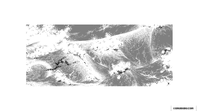
Pixelating the waves was quite a challenge, and took me some time to get
a clue of how it could be done.
I watched several television programs, such as Coast,
Deadliest Catch,
and Blue PlanetBlue Planet, besides referencing images to find out how a wave
looks.
Initially I drew the top of the waves with small strokes, which are
pointing towards the end of the wave where the wave falls apart.
I wasn't satisfied with the result, so I took another approach. This
time I drew a sort of craquelure - which many old paintings have - on
top of the wave and added a dithered transition from dark to light gray
and vice versa.
I also noticed that the transition towards the falling apart of the wave
was too obvious, too hard, so I reduced the contrast.
Along with this adjustment, I added more contrast underneath the wave,
so the contrast between the white water drops increases.
In this case, I didn't focus on every water drop/pixel separately, but
concentrated on the overall look.
Man-of-War ship
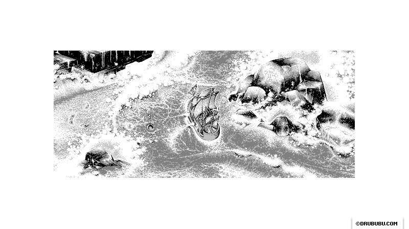
This area changed a few times. First there was just a wooden shoe, which I reduced in size.
At another place in the illustration, I drew a 'Portuguese Man-of-War
jellyfish'. On second thought, I was not satisfied with it, so I
replaced it with a real eighteenth century Man-of-War ship.
The shape of the ship is again a wooden shoe.
I used images of old ships - in this case a man-of-war, which I found
with Google Image Search, a handy resource for this.
Initially I used the original positions of the sails. Later on, I
decided to slightly adjust the sails at the front of the ship.
The original wooden shoe is hit by a canon from the warship. All you see
are what is left of the wooden shoe ship.
