Pixel Art & Dithering
For the pixel art illustration, I use a very limited pallet made up of
three 'colors'; light gray, dark gray, and black.
By using a limited palette, I am forced to make use of
dithering.
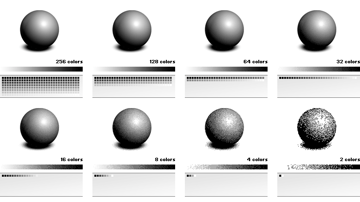
Dithering is used to create the illusion of color depth in images with a
limited amount of colors.
By using the available colors and mixing them, in-between colors are
mimicked. Depending on the lack of available colors, dithering becomes
visible as grain.
Dithering takes advantage of the human eye's tendency to mix colors in
close proximity to one another.

If you want to save a picture of a photograph as a GIF, you would
probably need to use dithering.
A picture of a photograph has a lot of different colors and gradations,
whereas the GIF file format only supports a limited amount of colors,
256 at most. The computer will use the 256 most frequent colors; the
remaining colors will be approximated by combining the same 256 colors.

Dither Types
You can choose between several types of dithering, each type having it
own specific characteristics.
In general, two types of dithering are used: dithering with a pattern
that is repeated, and dithering which tends to avoid repetitive
patterns.
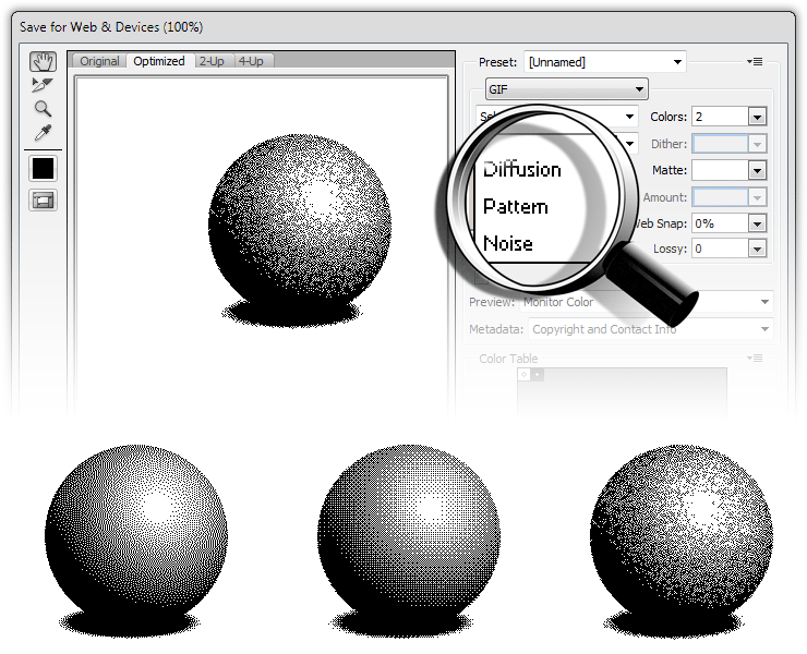
Adobe Photoshop offers three options for dithering; diffusion, pattern,
and noise (see image).
Select the file format GIF (JPG and PNG don't have a limited palette so
dithering is not relevant). Choose 'File' > 'Save for Web & Devices...'
(or ALT + F > ALT + SHIFT + CTRL + S) in Adobe Photoshop (see image).

'Noise' is the most preferable choice because this type of dithering results in the least amount of regular, i.e. visually annoying, patterns.
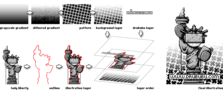
The next example shows the workflow of a simple pixel art illustration with the help of the dithering option in Adobe Photoshop. Most of the time dithering is done by hand, since most areas that have to be dithered are irregularly shaped.
Example

In Adobe Photoshop, a grayscale gradient is drawn and exported as a four color GIF image. The result is an image with four gray colors; black, dark gray, light gray, and white.
The background of the pixel art illustration is a repeating cross-shape
pattern. The pattern is drawn separately in one color. The pixel pattern
is used as a mask; the black pixels are cut out and the white pixels
remain white. The dithered gradient is positioned underneath the mask,
so that the dithered gradient becomes visible at the places where the
black pixels are cut out.
The dithered background is finished.
The Lady Liberty illustration is drawn. Once the illustration is
finished a two-pixels thick, red outline is drawn around the
illustration.
The red outline is removed in the pixel art illustration.
By using an outline, the contrast between foreground and background in
the final illustration is increased, giving the illustration a more
vivid look.
After drawing a small label with the text 'www.drububu.com', all
separate illustrations can be combined.
The illustration with Lady Liberty is carefully positioned over the
dithered background. Once Lady Liberty is positioned right, the label is
positioned on top of Lady Liberty.
The last thing that has to be done is the removal of the red outline. If
you choose to preserve the layers in Adobe Photoshop, the red pixels
have to be colored white, or the red pixels can be removed if you choose
to flatten the illustration.
Symmetry and Chaos
For dithering, choose either patterns which repeat, or completely
chaotic positioned pixels.
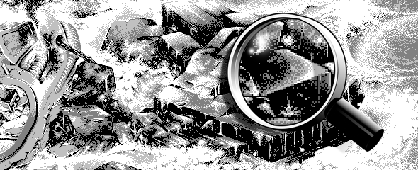
Your brain is very capable of detecting small differences in a chaotic
or repeating pattern; your eyes will be attracted to these areas (see image).

